7 Presentation Trends: Skyrocket Your Presentation Skills
The world is changing,and keeping up is no longer an option. Social distancing and work from home have moved offices onto the digital space. Presentations must now be more engaging to rise above the clutter.
By SAMUEL D
Communicating online comes with its challenges. There are so much competition and content for audiences to interact with. It is time to get creative with how you present your ideas.
Our article will show you 7 presentation trends that will skyrocket your presentation skills.
Trends to Skyrocket Your Presentation Skills
Start by having the right equipment to make your work easy. Such include the best software and laptops for designing your slides like a pro. Having a good device will make sure that you can create slides smoothly.
Now, let’s take a look at some of the trends you need to incorporate into your presentations below.
1. Minimalism

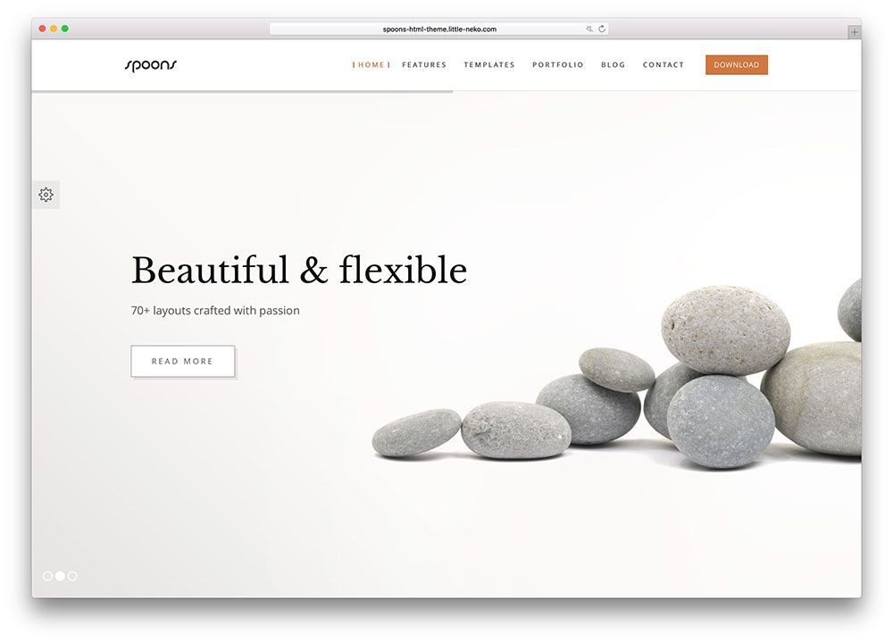
There is too much clutter everywhere, whether online or offline. Your designs should move away from such and embrace minimalism. Is it a new trend? No, but it is one that we do not see disappearing any time soon. The main basis of minimalism is simplicity and space. It allows for clarity in the presentations.
You avoid overwhelming your audiences with too much information. Remove clutter and distractions that may otherwise divert their attention. Elements to incorporate in the slides include simple typography and a lot of white space. Even if you opt to have colors, keep it at a minimum.
2. 3D and Animations
3D elements and animations will bring your presentations to life. It also allows you to intrigue the audience with the use of graphics. Having such on your slides brings depth and movement.
Isometric shapes or projections create an illusion of depth. Many engineers, illustrators, and tech websites use them. you will find them in graphical representations of 3D objects.

Even as you use them, be careful not to make them too complex. It would help if you also used the right techniques to guide the user’s eyes to the key messaging.
3. Create Your Typography

Some people continue to use what many would consider professional fonts. Such include times new Roman and Arial. There is nothing wrong with these fonts. So, if that is your preference, please go ahead.
But, designers are getting more creative by customizing fonts. It allows for a unique look that will make your audiences sit up.
Some customization options include freehand fonts. You get something that looks like your handwriting. It introduces a fun element and gives you a lot of freedom with typography customization.
4. Infographics Are Taking Center Stage

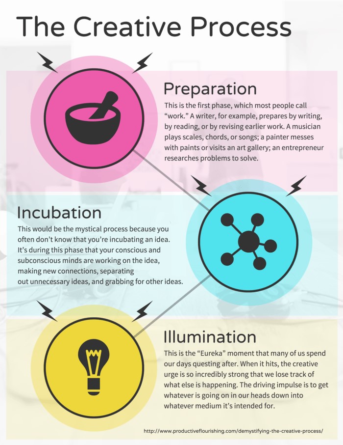
No one likes to sit through tons of text showcasing complex data. You lose the interest of the audience and will fail to communicate. Infographics use a combination of text and visuals. You break down data into easy to consume material.
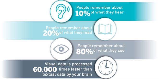
Engagement and interaction increase with the use of such. Remember the ‘humans are visual creatures’ line. Well, it is true. Our brains process visual information up to sixty times more than text. After three days, the audience will remember up to 65% of the presentation.
Think about the images you will use. You want to communicate, not beautify the slides. They should be relevant to the presentation. Have a mixture of photos, graphs, and illustrations.
You can also use the thousands of templates available in the online space. You communicate better when you customize them to what you want. Avoid the use of stock images as much as possible. Audiences interact better with real photos.
5. Balance the Text and Visuals

So how much text should you have when using visuals? The answer is as little as possible. You will need to text for headlines, titles, and descriptions. But, too much of it will distract audiences.
You want the audience to concentrate on what you are saying, not on trying to read the text. Use a large font size for better legibility although it limits how much text you can have.
6. Be Authentic and Use Stories
You win more points with people when you are authentic. Companies that focus on selling instead of communicating lose out. The modern customer will shy away from any brand that seems to be less than honest.
When coming up with your presentation, give facts that you can back up. Understand the customer’s pain point and provide a solution. The more trust they have, the higher your chances of conversions.
One fantastic tool at your disposal is the use of narrative or stories. You most likely remember some of the stories elders told you when growing up. The lessons in the stories are things you remember to date.
Now, it is your time to use what you learned. The audience wants to understand how you can help them. It helps to walk them through the journey in an exciting way. Even with visuals, create impactful, life-changing narratives.
7. Social Media Will Transform Presentations
Social media presentations are unique in one thing. They do not depend on the speaker to explain what is on the slides. You must communicate well, but it depends on how you put the presentation together.
Remember, the information will be open to interpretation. it will depend on who is looking at it. Simplicity and clarity will help remove any ambiguity in the messaging. Find ways to capture the audience’s attention.
3D elements, animations, and exciting visuals are some methods to use. Again, the tons of templates available will come to your rescue. It saves you from having to start everything from scratch.
Final Thoughts
Taking advantage of the latest presentation trends will Skyrocket your presentation skills. We have looked at 7 things you can do when working on your slides. Focus on engagement and interaction without distracting the audiences.
You want them to remember the presentation but, most importantly, the critical messaging. Simplicity always works well because you remove clutter. It could explain why minimalism continues to remain relevant years later.
Animations and 3D elements bring life to the presentation. Authenticity will help create an emotional connection. The use of stories is impactful and more interesting for the audiences.


